Daniel Clowes
I first looked at artist Daniel Clowes, who is an American cartoonist and screen-writer, most well-known for his comic books Ghost World and Eightball. Clowes was commissioned by Penguin in 2007, along with two other comic artists, to produce a redesign of Frankenstein in his usual comic style.


Clowes' draft of book cover:
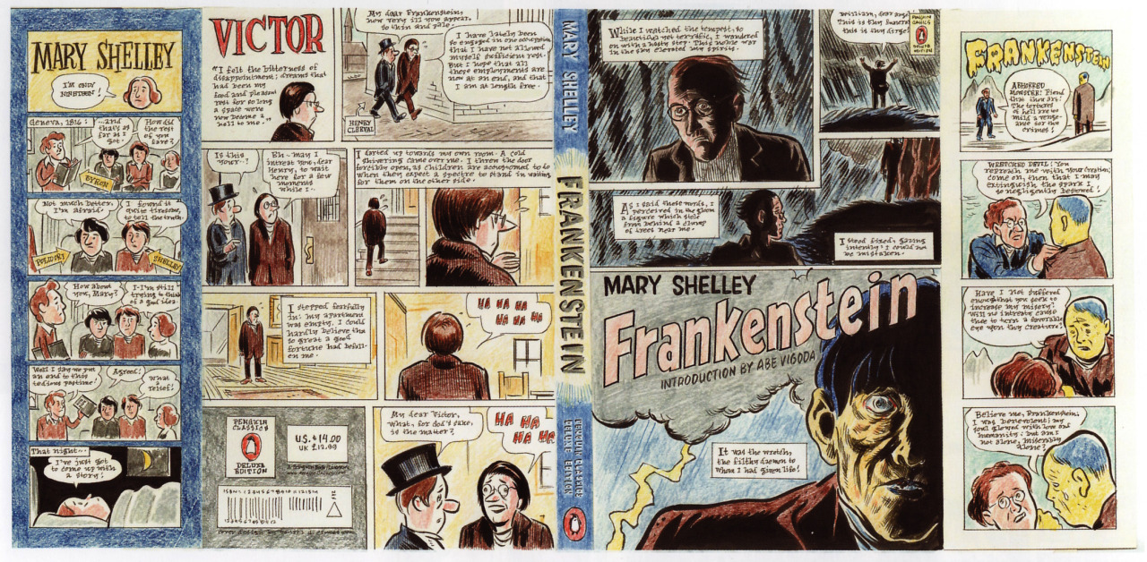
The design also makes use of the book's physicality by including images and narration on the flaps of the book jacket, which would be seen inside the book. The 'about the author' flap is also revamped with a comic-style appearance. Instead of a block of text, which is what is typically seen, the illustrator creates a comic about her background information, keeping in style of the rest of the book cover.

The front flap portrays a scene between Frankenstein and his monster.

Ruben Toledo
I next looked at Ruben Toledo who is a fashion illustrator known for his colourful, bright and theatrical images. He has designed mannequins, store windows, scarves, fabrics, carpets, album covers and murals. This artist brings a unique characterisation that somehow lends itself perfectly to classic literature, especially the gothic novels. When you look at the human characters in his designs, you can tell that they have been influenced by a fashion illustration background, which, with their sharp edges, translates wonderfully over to gothic literature. He also creates very strong, balanced compositions.


The Gothic inspiration is very much present in this book cover. A lost girl stars out at the viewer while a intimating mansion stretches beyond her. The cool blue colours, contrasted with one splash of blood red, add a chill to the illustration.

Darcy and Elizabeth pass each other disdainfully, though cannot help but glancing back at each other. The silhouetted figures and starkly contrasting monochrome colours really make this cover stand out.


Both these illustrators/designers but a unique twist on a classic book, which interests new and old audiences.
References:
http://frankensteinia.blogspot.co.uk/2010/10/covers-of-frankenstein-daniel-clowes.html
http://theotheradamford.wordpress.com/2009/12/09/seriously-the-best-book-covers-ever-bar-none/
http://www.us.penguingroup.com/pages/classics/ruben_toledo.html
http://artnectar.com/2011/04/book-cover-design-penguin-classics-illustrated-fashion-illustrator-ruben-toledo/
http://intheravenswood.blogspot.co.uk/2011/03/ruben-toledo-for-penguin-deluxe.html
No comments:
Post a Comment